Dracos Portal
Archive for
Comic Art Direction: A Directed Study
Hello, Peggy.
What I would like to do with your project is try to work in your style and present skill set. So, what I did was glean my library’s massive graphic novel collection and my own own manga library to help you.
The first thing I would like to bring up are backgrounds. BG’s carry the overall design of a film or comic. Think large to small. My background is largely film, so I am going to use film examples. An audience can immediately render a film as cheap if the BG’s are second rate. I great example is Quest for Camelot. This film cost nearly 200 million to make, but it still looked cheap, because the producers spent too much time development and nobody thought to hire a decenta team BG layout and render artist. This is what happens when you concentrate too much on the characters; you’ll have these lovingly drawn characters who don’t fit into their “universe”. The purpose of art direction is to unify all elements of the production designers concept art, therefore nothing can be lacking. Give the design of you project your 100% but don’t kill yourself while you try to do so.
Now you and I LOVE Wendy Pini. Her art is lovely, but look at the BG’s in book 3. She has trouble too and admitted so in interviews. Blue Mountain’s interior would’ve been far better had she gone spelunking in the Appalachians or elsewhere there are caves and did field studies of the world of Gliders. At present, her Blue Mountains interiors look secondary in many places to the characters. However, Wendy had a deadline so she soldiered on. Thank goodness she had assistants to distract our critical eye with their terrific ink work.
Speaking of assistants. Excalibur, Heavy Metal, DBZ, all of those detailed comics and manga use assistants. You just can’t get that much line mileage completed without someone to help you. Your eye fools you into thinking your work is completed after a while. Your brain says “I’ve had it!” and pushes you to get the project off your desk, only to tell you how you suck a year after the comic is published. This is where your editor and faithful team of assistants come on. You, dear creator have done your job with story, layout and pencils. Please let someone else apply the spit polish to your vision. Your ego may only share part of the glory—but it was still YOU to conceptualized this great story you were ever so brave enough to share with the world. Pass the inks of to your assistants and let them strain their eye and bruise their middle fingers for the final stretch. If you are still fighting your inner control freak, remind it that you are still the person to sign off the final draft before print.
If you have no choice, but to work by yourself, consider a simpler style. Bill Waterson had very minimal BG’s for Calvin and Hobbes and allowed the strip to be sketchy in just the right amount for presentation. He seems to have been in inspired by sumi-e ink drawings and Chinese inks. I just really find our who more of the artists are. They are more than worthy of fame. Yoshi Toshi and Hirshige are two of my favorites outside of the ubiquitous Hokkusai of the Japanese art world.
I have provided the first batch of scans of graphic novels and mangas with really simple styles. These creators did not let their limited drawing skill stop them frin telling their powerful stories and neither should you. Furthermore, their art improved as their story progressed, which proves that story is king. Drawing is just labor, a pencil is just a tool, but the story is the valuable intellectual property that will keep your family housed, fed, and clothed for generations to come.
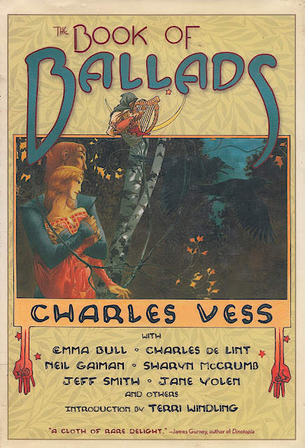
Canterbury Tales

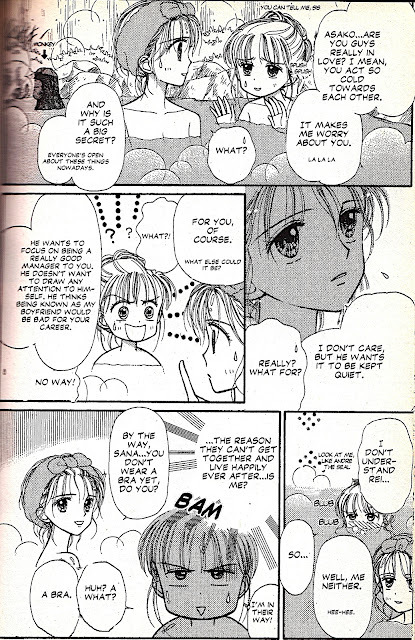
Kodomo no Omocha by Miho Obana
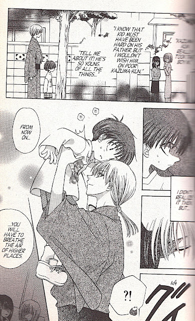
Furuba by Natsuki Takaya
Dragon Ball Z by Akira Toriyama
Akira would draw elaborate covers for his manga with simple art with the line milage mainly in the costumes and as you see, very simple tones. The covers and interiors were the same design universe though.
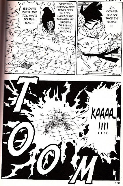
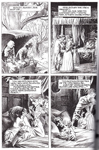
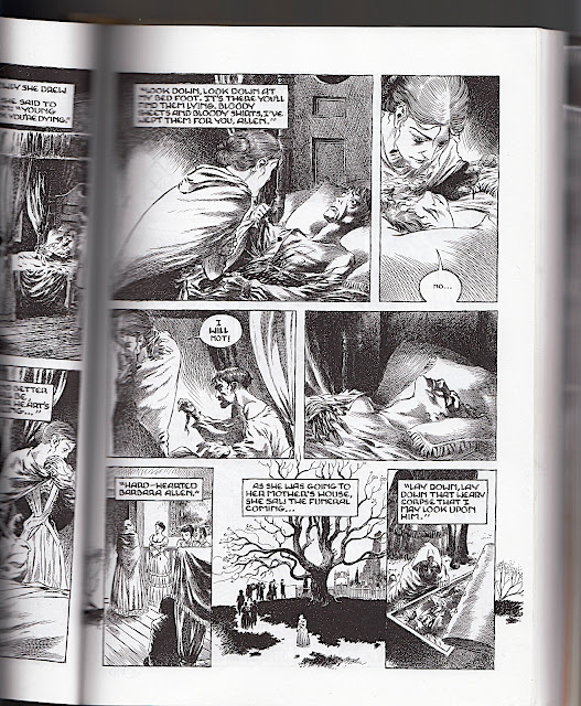
Note how in the Canterbury Tales, that the art is not that appealing, but it’s still neat. All of the lines are closed up. There are no gaps. In Ballads, the establishing shots are rendered with care. Many artists (myself included) love to get to the talking head shots because we love to draw hair and eyelashes–and acting. That’s very pretty, but it doesn’t support the story without the BG. Staging is important. Another thing to consider is staging. We’ll go more into this later, but note Toriyama’s dynamic staging compared to Obana’s and Takayama. Always try to stage at a 3/4. It draws the audience into the realm of your visual narrative better. If you hav not done this already, don’t sweat it. Life is long and there will other projects to apply this technique to.
Anyhoo, I hope this helps. Let’s Skype over questions, OK.
Happy drawing,
-Ashanti
Brought to you by:
Thanks in Advance :)

HipChick Comics’ First Graphic Novel: In Between Days

Follow Me On Facebook
Shop the Pantheist
KlashkaTse T-Shirts and sh*t!

Zazzle.com
The Yogini: More T-shirts for yoga practice!

HIpChick Playlist

Buy Original Works At My Etsy Shop
Buy Prints and Goodies of My Work at Red Bubble

http://www.redbubble.com/people/soleilsmile/shop
